Sunday, May 29, 2011

Thursday, May 19, 2011

Monday, May 16, 2011

Site Map & Gantt Chart

Site Map:


Gantt Chart:

Competitors Websites


Url

http://www.dunkindonuts.com/

Analysis
The layout look boring and arrangement sitll not bad .The colour look no attract people to view this website.


Url

http://www.dunkinina.com/index.php

Analysis
This website is same brand with first website but this website is from Indonesia .The layout colour look match to brand .The arrangement look good. At the top have many cute icon button.


Url

http://www.jcodonuts.com/


Analysis
The layout look simple and nice.This website using doughnut icon to design the button,It look attract people to click it.


Url

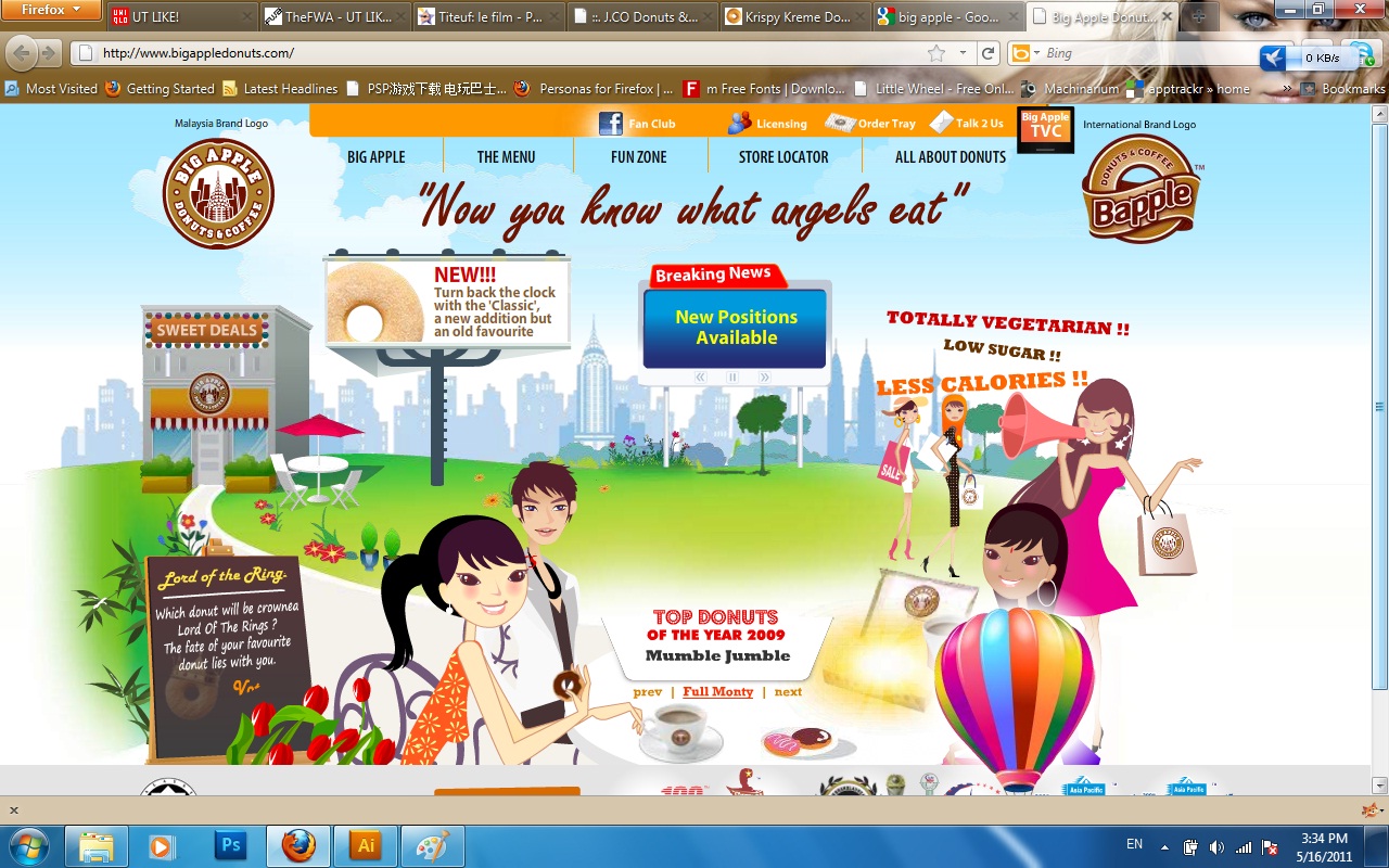
http://www.bigappledonuts.com/index.htm

Analysis
The layout look mess but the graphics look nice.There have a lot of information so it make me clear.

Design Tutorials


Url

http://psd.tutsplus.com/tutorials/photo-effects-tutorials/fantasy-mini-planet/


Url

http://psdlearning.com/2008/08/scanline-text/


Url

http://www.digitalartsonline.co.uk/tutorials/index.cfm?FeatureID=1750


Url

http://vector.tutsplus.com/tutorials/illustration/create-an-inspirational-vector-political-poster/